
Modern Kitchen Remodel
Get a before-and-after look at our modern kitchen remodel project.
Before the Kitchen Remodel
When we bought our home, we knew that the kitchen would need a refresh. At the time, we were expecting new countertops and maybe new cabinet fronts. Even that, we considered waiting to tackle. After all, we liked the idea of keeping the original cabinetry, since it seemed authentic.
We didn’t count on a burst pipe, which revealed clear signs of severe water damage under the sink. Nor did we expect that so many of the interior shelves would be broken or damaged.
After living with the kitchen for a few months, we decided to fully gut it and start from scratch with our modern kitchen remodel.
Below, you can see a few photos of the original kitchen.

This is the original kitchen, with the original light fixtures.
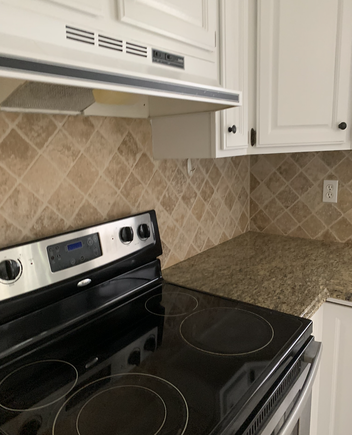
A closer photo of the original tile and countertop.

A view of the breakfast nook (with a new light fixture) toward the back door.
A front-on photo of the breakfast nook, standing near the oven. Do you see Birdie?
Modern Kitchen Inspiration
The most common question we got when talking about remodeling our kitchen was “are you going for an open concept?” In 2020, that seemed to be the watchword of kitchen design.
Nils and I were certain that we didn’t want to completely change the kitchen’s size or layout. We needed those walls! We found the original layout charming, and appreciate the efficiency of defined spaces.
We also use our kitchen; keeping that main wall meant we wouldn’t be looking at a mess when we were relaxing in the living room.
Just as importantly, Nils and I love to look outside. It seems like open floor plan homes beg you to look toward the center of the interior space. We didn’t want that; we wanted to encourage visitors to appreciate the natural light and the interplay between inside and out.
With those things in mind, I started the process of looking at design inspiration!
For me, looking at inspiration is the most fun part of any kitchen remodel. Pinterest is my favorite place to start.

This photo, from Spanish design blog Loko Loko, was the starting point for so many of my design concepts. I love how this blends contemporary look with accessible, familiar almost-penny tile. It seems to nod at the old bistro style. Plus, the open shelving above maximizes the natural light, while still feeling absolutely functional. The classic black-and-white brings it all together. For me, this kitchen checks all the boxes.

Created by L.A.-based Commune Design, this gorgeous breakfast nook feels warm, simple, and unpretentious. We really love the callback to 70s-style banquette seating, complete in warm earth tones.

We knew early on that our windows would have dark frames, so I tried to find images of kitchens with darker windows that didn't feel so heavy. While I'm not fond of either the gold fixtures nor the pseudo-farmhouse fixtures, I do really like how these colors and materials come together. Photo by Rejuvenation.

I have no idea where creator @heydavina was when she took this photo, but I love it. It's warm, clean, and natural. Plus, there's something about the texture of the walls that just invites you in.

Another example of dark windows with white walls and open shelving. I think this is the photo that really cemented the design vision that had started to form for our modern kitchen remodel. Kudos to another DIY designer, Shauna at The House of Silver Lining, for this one!

Another lovely breakfast nook, this one designed by Shazalynn Cavin-Winfrey. The wraparound gallery wall is a stroke of genius.
Modern Kitchen Design
We’d decided to keep the kitchen’s size and layout similar. That said, we did need to slightly update the kitchen layout to be more usable. After all, it’s hard to cook when you have only one outlet and no prep space near the stove.
A few other requirements: modern cabinets, minimal hardware, affordable, and functional.
We started with the cabinets, since those were likely to be the most expensive part of the modern kitchen remodel. After looking around at options for modern, high-gloss cabinets, it became clear that IKEA was going to be our best option. One decision helps make all of the other ones easier.
Below, you’ll see my initial sketch of our future kitchen.

Here, you can see us trying to maximize the natural light. We started by trying glass-fronted cabinet uppers, and also testing what it might look like to remove part of the wall between the kitchen and formal dining room. I also started playing with the idea of moving the range to the center wall, to give myself more prep space around the cooktop.
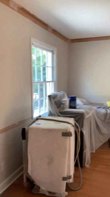
Kitchen Demo
As you’ll see from our demo pictures, we got a little carried away chasing the natural light.
We ultimately decided to take out the wall between the kitchen the dining room, while keeping the peninsula there. To maximize light, we will be adding open shelving to that exterior wall.

I was a little worried about taking out that wall, but now it's clear it was the right decision.

Looking back towards the former breakfast nook. I was also a little worried about losing the molding, but now it looks so much more streamlined.
Here's a mini walkthrough of the kitchen area mid0demo, looking through the dining room area into the breakfast nook. We'll have some low cabinets on the wall across from the window in the breakfast nook.